プラトー分析:堅牢な最適解とオーバーフィッティングを見分ける方法

「幻想なきバックテスト」シリーズ 第6回
study.optimize() を実行し、OptunaがPnL +87%のパラメータセットを発見した。興奮して戦略を本番投入する準備を始める。ところがライブトレード2週間後、PnLはほぼゼロ。何が起きたのか?
オプティマイザーはパラメータ空間の針の先端を見つけたのだ。パラメータは過去のトレード列に完璧にフィットしているが、市場環境がわずかに変わるだけで構造全体が崩壊する。これは典型的なオーバーフィッティングであり、投入前に検出できたはずだ。
前回の記事では座標降下法とベイズ最適化を比較し、Optunaがより効率的に最適解を見つける理由を示した。今回は次のステップ:見つけた最適解がノイズへのフィッティングではなく、堅牢であることを確認する方法だ。
「最良の」パラメータを見つけることが半分の仕事でしかない理由
 真の最適解を求めて広大な多次元パラメータ空間を探索するオプティマイザー
戦略パラメータの最適化は多次元空間における最大値の探索である。問題は、最大値には2種類あるということだ:
-
プラトー — パラメータの変動に対してPnLが一貫して高い、広くて平坦な領域。市場環境が変化して有効パラメータが10-20%ずれても、戦略は利益を出し続ける。
-
鋭いピーク — 正確なパラメータ値でのみPnLが高い、狭い頂点。パラメータを1ステップずらすだけで収益性が崩壊する。これはほぼ確実にオーバーフィッティングだ:オプティマイザーは安定したパターンではなく、過去データのアーティファクトを見つけたのだ。
登山のメタファー:プラトーは安全に歩き回れる山頂台地。鋭いピークは、バランスを取ることしかできない針の先端だ。
鋭いピーク vs 平坦なプラトー — 視覚的直感
 左:堅牢なプラトー(緩やかな斜面を持つ広いテーブルマウンテン)。右:脆弱な鋭いピーク(深い谷に囲まれた針の先端)
2つの戦略パラメータを軸、PnLを色で表した等高線図を想像してほしい。2つのパターンは視覚的に容易に区別できる:
プラトー(堅牢な最適解):
- 同じ色の広い領域
- PnLレベル間の滑らかな遷移
- 等高線の間隔が広い
- 最適値から+/-20%ずれてもPnLの変化は10%以内
ヒートマップを想像してほしい:中央に、マップ全体の約3分の1の大きさの明るい黄色の長方形がある。色は端に向かって徐々にオレンジ、そして赤に変化する。最適解は点ではなく、領域である。
鋭いピーク(オーバーフィッティング):
- 冷たい色に囲まれた狭い明るい点
- 急激な変化:最適解のすぐ隣で崩壊
- 等高線が密な同心円に圧縮
- +/-5%のずれでPnLが50%以上下落
同じヒートマップを想像してほしいが、中央には小さな黄色い点があり、すぐに青と紫に囲まれている。唯一の「正しい」パラメータ組み合わせ。
パラメータ感度分析
 個々のパラメータ値に対するPnLの依存性を示すスライスプロット — 広いバンドは堅牢性を、狭いクラスターは脆弱性を示す
一次元分析:PnL vs 単一パラメータ
最もシンプルなアプローチ — 1つのパラメータを除いて全てを固定し、PnLがその値にどう依存するかを見る。Optunaはこのための plot_slice を提供している:
import optuna
from optuna.visualization import plot_slice

study = optuna.create_study(direction="maximize")
study.optimize(objective, n_trials=500)

fig = plot_slice(study, params=["htf_entry_sell", "ltf_momentum", "stop_loss_pct"])
fig.show()
スライスプロットの見方:
- 堅牢なパラメータ: 点群が最適値付近で広い水平帯を形成する。最良のトライアルがパラメータ値の広い範囲に分散している。
- 脆弱なパラメータ: 最良のトライアルが狭い範囲に集中している。パラメータを1〜2ステップずらすと収益性が崩壊する。
二次元分析:等高線プロット(ヒートマップ)
等高線プロットは2つのパラメータの相互作用を同時に示す。パラメータが独立に作用することはめったになく、エントリーとエグジットの閾値、タイムフレーム、ポジションサイズは相互に関連しているため、これはプラトー分析の鍵となるツールだ。
from optuna.visualization import plot_contour

fig = plot_contour(study, params=["htf_entry_sell", "htf_exit_buy"])
fig.show()
堅牢なパラメータペアの等高線プロットは、丘陵平野の地形図のように見える:滑らかで広い等高線、同じ色の大きな領域。脆弱なペアの等高線プロットは、火山錐の地図のように見える:単一の点を中心とした密な同心円。
12個の分離パラメータを持つ戦略の場合、 のペアワイズ等高線プロットが得られる。すべてを調べる必要はない — Optunaが最も重要と評価したパラメータから始めよう。
多次元分析:パラメータ重要度ランキング
Optunaは各パラメータの目的関数への寄与度を推定できる:
from optuna.visualization import plot_param_importances

fig = plot_param_importances(study)
fig.show()
パラメータ重要度チャートは水平ヒストグラムである。パラメータはPnL分散への寄与度の降順でランク付けされる。通常、上位3-4個のパラメータが分散の70-80%を説明する。
ルール: パラメータがPnL分散の2%未満しか説明しない場合、その値は結果にほとんど関係ない — 定義上堅牢だ。プラトー分析は最も重要な上位5つのパラメータに集中させよう。
Optunaの可視化ツール
 パラメータ相互作用のランドスケープを示す等高線ヒートマップと重要度ランキング
plot_slice — 一次元スライス
import optuna
from optuna.visualization import plot_slice

fig = plot_slice(study, params=[
    "htf_entry_sell", "htf_entry_buy",
    "ltf_momentum_threshold", "stop_loss_pct",
    "take_profit_pct", "trailing_stop_pct"
])
fig.update_layout(height=800, title="Parameter Slice Plots")
fig.show()
結果 — 散布図のグリッド。各サブプロットは、単一パラメータ値(X軸)に対する目的関数値(PnL、Y軸)を示す。点は個々のトライアル。堅牢なパラメータの場合、最良の点(最高PnL)はXの広い範囲に分布する。脆弱なパラメータの場合 — 狭い列にグループ化される。
plot_contour — 二次元等高線
from optuna.visualization import plot_contour

important_pairs = [
    ["htf_entry_sell", "htf_entry_buy"],
    ["htf_entry_sell", "stop_loss_pct"],
    ["ltf_momentum_threshold", "take_profit_pct"],
]

for params in important_pairs:
    fig = plot_contour(study, params=params)
    fig.update_layout(title=f"Contour: {params[0]} vs {params[1]}")
    fig.show()
各等高線プロットは、2つのパラメータを軸とするヒートマップ。色はパラメータ空間の特定の領域における平均PnLをエンコードする。黄/緑 — 高PnL、青/紫 — 低PnL。等高線は同じPnLの点を結ぶ。
plot_param_importances — パラメータ寄与度
from optuna.visualization import plot_param_importances

fig = plot_param_importances(
    study,
    evaluator=optuna.importance.FanovaImportanceEvaluator()
)
fig.show()
fANOVA(関数ANOVA)は目的関数の分散をパラメータとその相互作用に分解する。非線形効果を考慮するため、単純な相関よりも強力だ。
定量的プラトーメトリクス
 感度比、プラトー幅、堅牢性スコア — プラトーの品質を定量化する3つのメトリクス
視覚的評価は主観的だ。数値が必要だ。「プラトー」の概念を定量化する3つのメトリクスを紹介する。
感度比
PnLの変化量とパラメータの変化量の比:
ここで はパラメータ が最適値から ずれた時のPnL低下量。
解釈:
- — パラメータは堅牢:10%のずれでPnL低下は5%未満
- — 中程度の感度
- — パラメータは脆弱:10%のずれでPnLが20%以上低下
プラトー幅
PnLが最適値の 以内に留まるパラメータ領域の幅:
相対プラトー幅:
分母はパラメータの全探索範囲。
解釈:
- — プラトーが10%閾値で範囲の30%以上をカバー。堅牢なパラメータ。
- — プラトーが範囲の5%未満。レッドフラグ。
堅牢性スコア
全パラメータにわたる統合メトリクス:
ここで はfANOVAによるパラメータ の正規化重要度()。
重み付き幅の積は厳格なメトリクスだ:重要なパラメータが1つでも狭いプラトーを持つと、 は低くなる。重要でないパラメータ( が小さい)はほとんど影響しない。
解釈:
- — 戦略は堅牢
- — 追加検証が必要(ウォークフォワード)
- — オーバーフィッティングの可能性が非常に高い
自動プラトー検出のPythonコード
 パラメータランドスケープをスキャンして堅牢なプラトーと脆弱なピークを識別する自動化システム
import numpy as np
import optuna
from optuna.importance import FanovaImportanceEvaluator
from typing import Dict, List, Tuple

def compute_sensitivity_ratio(
    study: optuna.Study,
    param_name: str,
    n_steps: int = 20,
) -> float:
    """
    Compute sensitivity ratio for a single parameter.

    Fixes all parameters at their best values, varies param_name,
    estimates PnL drop through trial interpolation.
    """
    best_trial = study.best_trial
    best_value = best_trial.values[0]
    best_param = best_trial.params[param_name]

    all_trials = [t for t in study.trials if t.state == optuna.trial.TrialState.COMPLETE]
    all_trials.sort(key=lambda t: t.values[0], reverse=True)
    top_trials = all_trials[:max(10, len(all_trials) // 5)]

    param_values = np.array([t.params[param_name] for t in top_trials])
    pnl_values = np.array([t.values[0] for t in top_trials])

    if best_param == 0 or best_value == 0:
        return float('inf')

    from numpy.polynomial import polynomial as P
    coeffs = np.polyfit(param_values, pnl_values, deg=2)
    dpnl_dparam = 2 * coeffs[0] * best_param + coeffs[1]

    sensitivity = abs(dpnl_dparam * best_param / best_value)
    return sensitivity


def compute_plateau_width(
    study: optuna.Study,
    param_name: str,
    threshold_pct: float = 10.0,
) -> Tuple[float, float]:
    """
    Compute absolute and relative plateau width.

    Returns:
        (absolute_width, relative_width)
    """
    best_value = study.best_value
    threshold = best_value * (1 - threshold_pct / 100)

    trials = [t for t in study.trials if t.state == optuna.trial.TrialState.COMPLETE]
    good_trials = [t for t in trials if t.values[0] >= threshold]

    if not good_trials:
        return 0.0, 0.0

    good_params = [t.params[param_name] for t in good_trials]
    all_params = [t.params[param_name] for t in trials]

    plateau_min = min(good_params)
    plateau_max = max(good_params)
    absolute_width = plateau_max - plateau_min

    search_range = max(all_params) - min(all_params)
    relative_width = absolute_width / search_range if search_range > 0 else 0

    return absolute_width, relative_width


def compute_robustness_score(
    study: optuna.Study,
    threshold_pct: float = 10.0,
) -> Dict:
    """
    Compute combined robustness score.

    Returns:
        dict with per-parameter metrics and the final score
    """
    evaluator = FanovaImportanceEvaluator()
    importances = optuna.importance.get_param_importances(
        study, evaluator=evaluator
    )

    results = {}
    total_importance = sum(importances.values())

    for param_name, importance in importances.items():
        sensitivity = compute_sensitivity_ratio(study, param_name)
        abs_width, rel_width = compute_plateau_width(
            study, param_name, threshold_pct
        )

        weight = importance / total_importance
        results[param_name] = {
            "importance": importance,
            "weight": weight,
            "sensitivity_ratio": sensitivity,
            "plateau_width_abs": abs_width,
            "plateau_width_rel": rel_width,
        }

    log_score = sum(
        r["weight"] * np.log(max(r["plateau_width_rel"], 1e-10))
        for r in results.values()
    )
    robustness_score = np.exp(log_score)

    return {
        "robustness_score": robustness_score,
        "parameters": results,
        "verdict": (
            "robust" if robustness_score > 0.1
            else "check" if robustness_score > 0.01
            else "overfitting"
        ),
    }
使用方法
report = compute_robustness_score(study, threshold_pct=10.0)

print(f"Robustness score: {report['robustness_score']:.4f}")
print(f"Verdict: {report['verdict']}")
print()

for name, metrics in report["parameters"].items():
    print(f"  {name}:")
    print(f"    Importance:       {metrics['importance']:.3f}")
    print(f"    Sensitivity:      {metrics['sensitivity_ratio']:.2f}")
    print(f"    Plateau width:    {metrics['plateau_width_rel']:.1%}")
    print()
出力例:
Robustness score: 0.1482
Verdict: robust

  htf_entry_sell:
    Importance:       0.312
    Sensitivity:      0.38
    Plateau width:    42.5%

  htf_entry_buy:
    Importance:       0.251
    Sensitivity:      0.45
    Plateau width:    38.1%

  ltf_momentum_threshold:
    Importance:       0.187
    Sensitivity:      1.21
    Plateau width:    22.3%

  stop_loss_pct:
    Importance:       0.098
    Sensitivity:      0.67
    Plateau width:    31.0%

  take_profit_pct:
    Importance:       0.072
    Sensitivity:      0.89
    Plateau width:    28.4%

  trailing_delta:
    Importance:       0.031
    Sensitivity:      0.22
    Plateau width:    55.2%
分離戦略の実践例
 戦略A(広いプラトー、堅牢)、戦略B(中程度)、戦略C(鋭いピーク、オーバーフィット)の比較
12個の分離パラメータを持つ3つの戦略を検証する。各戦略は500トライアルのOptuna最適化を受けた。
戦略A(PnL約55%、約500トレード、約15%時間)
戦略Aのパラメータは広いプラトーを形成する。主要パラメータ htf_entry_sell を見てみよう:
- 最適値:0.020
- 0.015でのPnL:+51%(7%低下)
- 0.025でのPnL:+49%(11%低下)
- 0.010でのPnL:+43%(22%低下)
- 0.030でのPnL:+41%(25%低下)
一次元プロット(X軸 — htf_entry_sell の値、Y軸 — PnL)を想像すると、平坦な頂部を持つ緩やかな放物線が見える。0.010-0.030の範囲がプラトーで、PnLが最適値の+/-25%以内に留まる。
感度比: — 堅牢。
10%閾値でのプラトー幅:0.013から0.027、。
戦略B(PnL約25%、約40トレード、約5%時間)
戦略Bは少ないトレード数で最適化されている。パラメータ htf_entry_sell:
- 最適値:0.018
- 0.015でのPnL:+24%(4%低下)
- 0.025でのPnL:+9%(64%低下)
- 0.012でのPnL:+11%(56%低下)
プロット上 — 非対称で急峻な曲線。プラトーは0.015-0.020の狭い範囲にのみ存在する。最適値の右側は崖。
感度比: — 中程度の感度だが、40トレードではこれはレッドフラグ。小さなサンプル + 狭いプラトー = 高いオーバーフィッティング確率。
10%閾値でのプラトー幅:0.016から0.020、。
戦略C(PnL約300%、約400トレード、約45%時間)
戦略Cは驚異的なPnLを示すが、プラトー分析で問題が明らかになる:
htf_entry_sellの最適値:0.022- 0.020でのPnL:+295%(2%低下)
- 0.025でのPnL:+142%(**53%**低下)
- 0.019でのPnL:+128%(**57%**低下)
プロット上 — 特徴的な「針」:0.022で非常に高いピーク、全方向への急激な低下。等高線プロットでは、冷たい色にすぐに囲まれた明るい点が表示される。
感度比: — 脆弱。400トレードにもかかわらず、戦略は単一パラメータの正確な値に過度に依存している。
10%閾値でのプラトー幅:0.021から0.023、。
まとめ表
| 戦略 | PnL | トレード数 | 感度 | プラトー幅 | 堅牢性スコア | 判定 |
|---|---|---|---|---|---|---|
| 戦略A | +55% | 約500 | 0.44 | 35% | 0.148 | 堅牢 |
| 戦略B | +25% | 約40 | 1.64 | 10% | 0.032 | 要確認(小サンプル) |
| 戦略C | +300% | 約400 | 3.79 | 5% | 0.008 | オーバーフィッティング |
パラドックス: PnL +300%の戦略Cが最悪の堅牢性スコアを持つ。「控えめな」+55%の戦略Aが最も堅牢。これはプラトー分析の典型的な結果だ:印象的な数字はしばしば脆弱性を隠している。
各戦略の信頼区間はモンテカルロ・ブートストラップでさらに検証できる — トレードのリサンプリング時のPnLのばらつきを示す。
3D可視化とヒートマップ
 2つのパラメータ上のPnLの3D表面プロットと床面に投影された等高線
最も重要なパラメータペアについて、3D表面とヒートマップを構築すると有用だ。ランドスケープの形状を直感的に理解できる。
import numpy as np
import matplotlib.pyplot as plt
from matplotlib import cm
from mpl_toolkits.mplot3d import Axes3D

def plot_parameter_landscape(
    study: "optuna.Study",
    param_x: str,
    param_y: str,
    grid_size: int = 50,
):
    """
    Build a 3D surface plot and heatmap for a pair of parameters.
    """
    trials = [t for t in study.trials
              if t.state == optuna.trial.TrialState.COMPLETE]

    x_vals = np.array([t.params[param_x] for t in trials])
    y_vals = np.array([t.params[param_y] for t in trials])
    z_vals = np.array([t.values[0] for t in trials])

    from scipy.interpolate import griddata

    xi = np.linspace(x_vals.min(), x_vals.max(), grid_size)
    yi = np.linspace(y_vals.min(), y_vals.max(), grid_size)
    Xi, Yi = np.meshgrid(xi, yi)
    Zi = griddata((x_vals, y_vals), z_vals, (Xi, Yi), method='cubic')

    fig = plt.figure(figsize=(18, 7))

    ax1 = fig.add_subplot(121, projection='3d')
    surf = ax1.plot_surface(Xi, Yi, Zi, cmap=cm.viridis, alpha=0.85,
                            edgecolor='none')
    ax1.set_xlabel(param_x)
    ax1.set_ylabel(param_y)
    ax1.set_zlabel('PnL, %')
    ax1.set_title('3D Parameter Landscape')
    fig.colorbar(surf, ax=ax1, shrink=0.5)

    ax2 = fig.add_subplot(122)
    hm = ax2.pcolormesh(Xi, Yi, Zi, cmap=cm.viridis, shading='auto')
    contours = ax2.contour(Xi, Yi, Zi, levels=10, colors='white',
                           linewidths=0.8, alpha=0.7)
    ax2.clabel(contours, inline=True, fontsize=8, fmt='%.0f%%')

    best = study.best_trial
    ax2.scatter(best.params[param_x], best.params[param_y],
                color='red', s=100, marker='*', zorder=5, label='Optimum')

    ax2.set_xlabel(param_x)
    ax2.set_ylabel(param_y)
    ax2.set_title('Contour Heatmap')
    ax2.legend()
    fig.colorbar(hm, ax=ax2)

    plt.tight_layout()
    plt.savefig(f'landscape_{param_x}_vs_{param_y}.png', dpi=150)
    plt.show()
堅牢な戦略の3D表面プロットはテーブルマウンテンに似ている — 緩やかな斜面を持つ平坦な頂部。脆弱な戦略の場合 — マッターホルンのような鋭いピーク。ヒートマップは3Dビューを補完し、同じ情報を等高線付きの上面投影で表示する。
レッドフラグ:最適化結果が疑わしい場合
 最適化結果における潜在的なオーバーフィッティングを示す警告指標
最適化が実際のパターンではなくオーバーフィッティングを見つけた8つの兆候:
1. 主要パラメータの感度比 > 2
10%のパラメータシフトでPnLが20%以上低下する場合 — 最適解は脆弱だ。
2. プラトー幅 < 探索範囲の10%
「良い」領域が探索範囲の10%未満を占める場合 — オプティマイザーはアーティファクトを見つけた可能性が高い。
3. 上位3トライアルのPnLが中央値の2-3倍
最良のトライアルが「丘の頂上」ではなく、残りに対する外れ値である場合 — プラトーではない。
top_3_mean = np.mean(sorted([t.values[0] for t in study.trials
                              if t.state == optuna.trial.TrialState.COMPLETE],
                             reverse=True)[:3])
median_pnl = np.median([t.values[0] for t in study.trials
                         if t.state == optuna.trial.TrialState.COMPLETE])

outlier_ratio = top_3_mean / median_pnl
if outlier_ratio > 2.5:
    print(f"WARNING: Top trials are {outlier_ratio:.1f}x above median — possible overfitting")
4. 低トレード数(< 50)で高PnL
小サンプル + 高PnL = 推定値の高い分散。40トレードでのプラトー分析はそれ自体が信頼性に欠ける。このような戦略にはモンテカルロ・ブートストラップが不可欠。
5. 1つの「魔法の」パラメータ組み合わせ
等高線プロットがグレーのフィールドの中に1つの明るい点を示す場合 — これは戦略ではなく、データにフィットした組み合わせだ。
6. パラメータが多すぎる
12個のパラメータでそれぞれ10個の値がある場合、探索空間は の組み合わせを含む。Optunaは約500を探索する。このような空間で「良い」アーティファクトを見つける確率は高い。パラメータが多いほど、プラトー分析はより厳格でなければならない。
7. アウトオブサンプルでPnLが急激に低下
インサンプルPnLが+87%でウォークフォワードが+12%を示す場合 — 最適化がパラメータをトレーニング期間にフィットさせた。詳細はウォークフォワード最適化の記事を参照。
8. パラメータが範囲の境界に「固定」されている
最適値が探索グリッドの境界と一致する場合 — 最適解は範囲外にある可能性がある。範囲を拡大して最適化を再実行しよう。
自動プラトー分析レポート
すべてを、各最適化後に生成される単一のレポートにまとめる:
import json
from datetime import datetime

def generate_plateau_report(
    study: "optuna.Study",
    strategy_name: str,
    n_trades: int,
    threshold_pct: float = 10.0,
) -> dict:
    """
    Generate a complete plateau analysis report.
    """
    robustness = compute_robustness_score(study, threshold_pct)

    red_flags = []

    sorted_params = sorted(
        robustness["parameters"].items(),
        key=lambda x: x[1]["importance"],
        reverse=True
    )
    for name, metrics in sorted_params[:3]:
        if metrics["sensitivity_ratio"] > 2.0:
            red_flags.append(
                f"High sensitivity for {name}: "
                f"S={metrics['sensitivity_ratio']:.2f}"
            )

    for name, metrics in robustness["parameters"].items():
        if metrics["plateau_width_rel"] < 0.05:
            red_flags.append(
                f"Narrow plateau for {name}: "
                f"W={metrics['plateau_width_rel']:.1%}"
            )

    all_values = sorted(
        [t.values[0] for t in study.trials
         if t.state == optuna.trial.TrialState.COMPLETE],
        reverse=True
    )
    if len(all_values) > 10:
        top3 = np.mean(all_values[:3])
        med = np.median(all_values)
        if med > 0 and top3 / med > 2.5:
            red_flags.append(
                f"Top trials are outliers: "
                f"{top3:.1f} vs median {med:.1f} "
                f"({top3/med:.1f}x)"
            )

    if n_trades < 50:
        red_flags.append(f"Low trade count: {n_trades}")

    report = {
        "strategy": strategy_name,
        "timestamp": datetime.now().isoformat(),
        "best_pnl": study.best_value,
        "n_trials": len(study.trials),
        "n_trades": n_trades,
        "robustness_score": robustness["robustness_score"],
        "verdict": robustness["verdict"],
        "red_flags": red_flags,
        "parameters": robustness["parameters"],
    }

    return report


report = generate_plateau_report(
    study, strategy_name="Strategy A", n_trades=491
)

print(json.dumps(report, indent=2, default=str))
出力例:
{
  "strategy": "Strategy A",
  "best_pnl": 55.2,
  "n_trials": 500,
  "n_trades": 491,
  "robustness_score": 0.1482,
  "verdict": "robust",
  "red_flags": [],
  "parameters": {
    "htf_entry_sell": {
      "importance": 0.312,
      "sensitivity_ratio": 0.44,
      "plateau_width_rel": 0.35
    }
  }
}
ウォークフォワード検証との関係
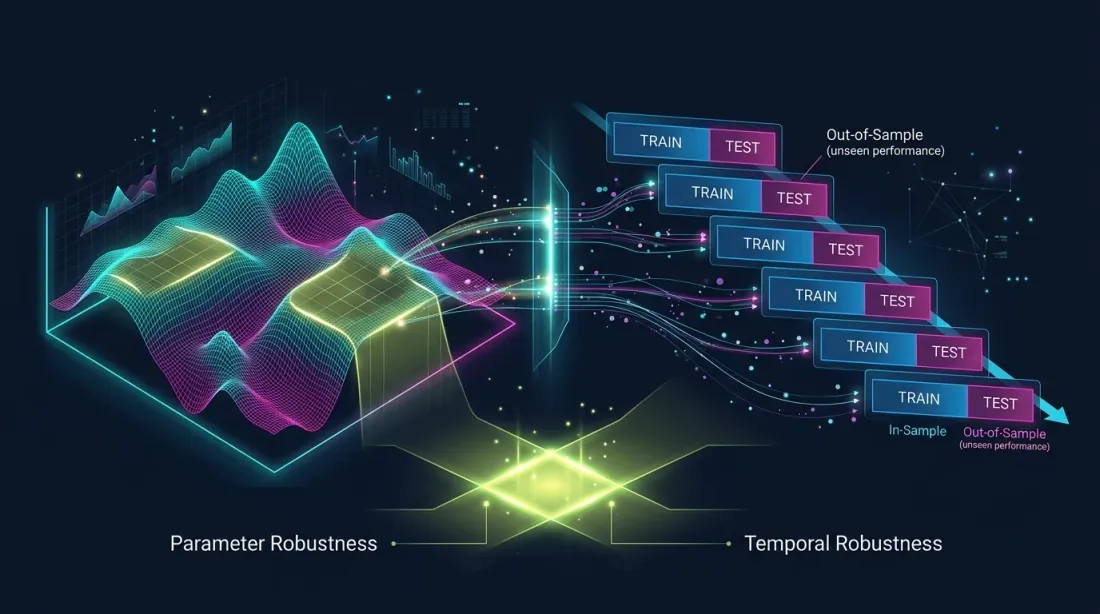 パラメトリック堅牢性(プラトー分析)と時間的堅牢性(ウォークフォワード)— 2つの補完的な検証システム
プラトー分析とウォークフォワード検証(WFO)は補完的な手法だ:
- プラトー分析は次の問いに答える:「最適解は小さなパラメータシフトに対してどれだけ安定しているか?」これはパラメトリック堅牢性のチェックだ。
- ウォークフォワードは次の問いに答える:「パラメータはオプティマイザーが見ていないデータでも機能するか?」これは時間的堅牢性のチェックだ。
戦略はプラトー分析をパスしても(広いプラトー)、ウォークフォワードで失敗する(市場レジームが変化した)ことがある。逆もまた然り — 固定パラメータでウォークフォワードをパスしても、脆弱な最適解を持つことがある。
推奨: 常に両方の手法を使用すること。戦略がプラトー分析()かつウォークフォワード()をパスすれば — これは堅牢性の強いシグナルだ。詳細はウォークフォワード最適化の記事を参照。
各段階でのPnL信頼区間を評価するには、モンテカルロ・ブートストラップを適用しよう。アクティブ時間が異なる戦略を正しく比較するには、アクティブ時間あたりPnLメトリクスを使用しよう。
推奨事項
最適化の前に
-
パラメータ数を制限する。 パラメータが少ないほど、プラトーの信頼性が高い。5-7個のパラメータが合理的な上限。12個はすでに注意が必要だ。
-
意味のある範囲を設定する。 現実的な範囲が0.005から0.05であれば、
htf_entry_sellを0.001から1.0に設定しないこと。不必要に広い範囲はプラトーの幻想を作り出す。 -
十分なトライアル数を使用する。 12個のパラメータの場合、最低300-500トライアル。信頼性の高いプラトー分析には1000以上。
最適化中
-
収束を監視する。 Optunaが400トライアル後も大幅に良い解を見つけ続ける場合 — プロセスは収束しておらず、プラトー分析は信頼できない。
-
枝刈りは慎重に使用する。 アグレッシブな枝刈り(MedianPruner)は、初期ステップでは悪く見えるが完全なランドスケープの構築には重要なトライアルをカットする可能性がある。
最適化の後に
-
プラトーレポートを自動生成する。
generate_plateau_report()を最適化パイプラインに統合する。視覚的評価に頼らず、数値を使おう。 -
上位5パラメータを確認する。 fANOVAが3つのパラメータが分散の80%を説明すると示す場合 — 残りの9つはより簡略にチェックできる。
-
ベースライン戦略と比較する。 デフォルトパラメータ(最適化なし)の戦略が+30%を示し、最適化後が+55%の場合 — 差はわずか25ppで、プラトーはおそらく広い。デフォルトが0%で、最適化後が+300%の場合 — すべての収益性が正確なパラメータフィッティングに依存している。
-
最終チェック — ウォークフォワード。 プラトー分析は堅牢性の必要条件ではあるが十分条件ではない。常にアウトオブサンプルで検証しよう。
結論
パラメータ最適化は強力なツールだが、プラトー分析なしではルーレットだ。安定したパターンを見つけたのか、ノイズにモデルをフィットさせたのかがわからない。
プラトー分析の3つのルール:
-
堅牢性スコアを計算する。 重み付きプラトー幅の積が、すべてのパラメータの堅牢性を要約する単一の数値を与える。 — ゴーサイン。
-
主要パラメータの感度比 < 1。 10%のパラメータシフトでPnL低下が10%未満なら — パラメータは堅牢。それ以上なら — 注意が必要。
-
等高線プロットを可視化する。 ランドスケープの形状の理解を置き換えるメトリクスはない。平坦なテーブルマウンテン — 良い。鋭い針 — 悪い。
プラトー分析は最適化後に5分かかり、数週間の不採算ライブトレードを防ぐことができる。study.optimize() とボット投入の間の必須ステップだ。
参考リンク
- Optuna Documentation — Visualization
- Hutter, F., Hoos, H., Leyton-Brown, K. — An Efficient Approach for Assessing Hyperparameter Importance (fANOVA, 2014)
- Pardo, R. — The Evaluation and Optimization of Trading Strategies
- Marcos Lopez de Prado — Advances in Financial Machine Learning, Chapter 11: Dangers of Backtesting
- Bailey, D.H. et al. — The Probability of Backtest Overfitting (2015)
- Optuna — optuna.visualization.plot_contour
- Optuna — optuna.importance.FanovaImportanceEvaluator
- Bergstra, J. & Bengio, Y. — Random Search for Hyper-Parameter Optimization (2012)
Citation
@article{soloviov2026plateauanalysis,
  author = {Soloviov, Eugen},
  title = {Plateau Analysis: How to Distinguish a Robust Optimum from Overfitting},
  year = {2026},
  url = {https://marketmaker.cc/en/blog/post/plateau-analysis-overfitting},
  version = {0.1.0},
  description = {Why finding the best strategy parameters is only half the work. How to visually and quantitatively distinguish a stable plateau from a fragile peak, and why Optuna contour plots are a mandatory step before launching an optimized strategy into production.}
}
Authors

Trading-systems engineer
Trading-systems engineer building bots since 2017: cross-exchange arbitrage (connected up to 30 venues), cointegration-based pairs arbitrage across spot and futures, scalping, news and sentiment-driven strategies, trend algorithms, and portfolio management and balancing algorithms. Also builds sub-millisecond order execution, big-data warehouses, backtesting engines, AI agents, and trading interfaces (incl. open-source profitmaker.cc). Stack: JS/TS, Python, Rust/Zig/Go, DevOps, backend, frontend, architecture.